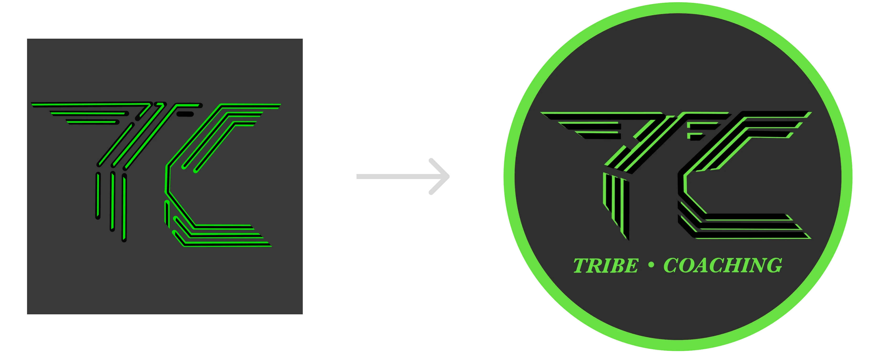
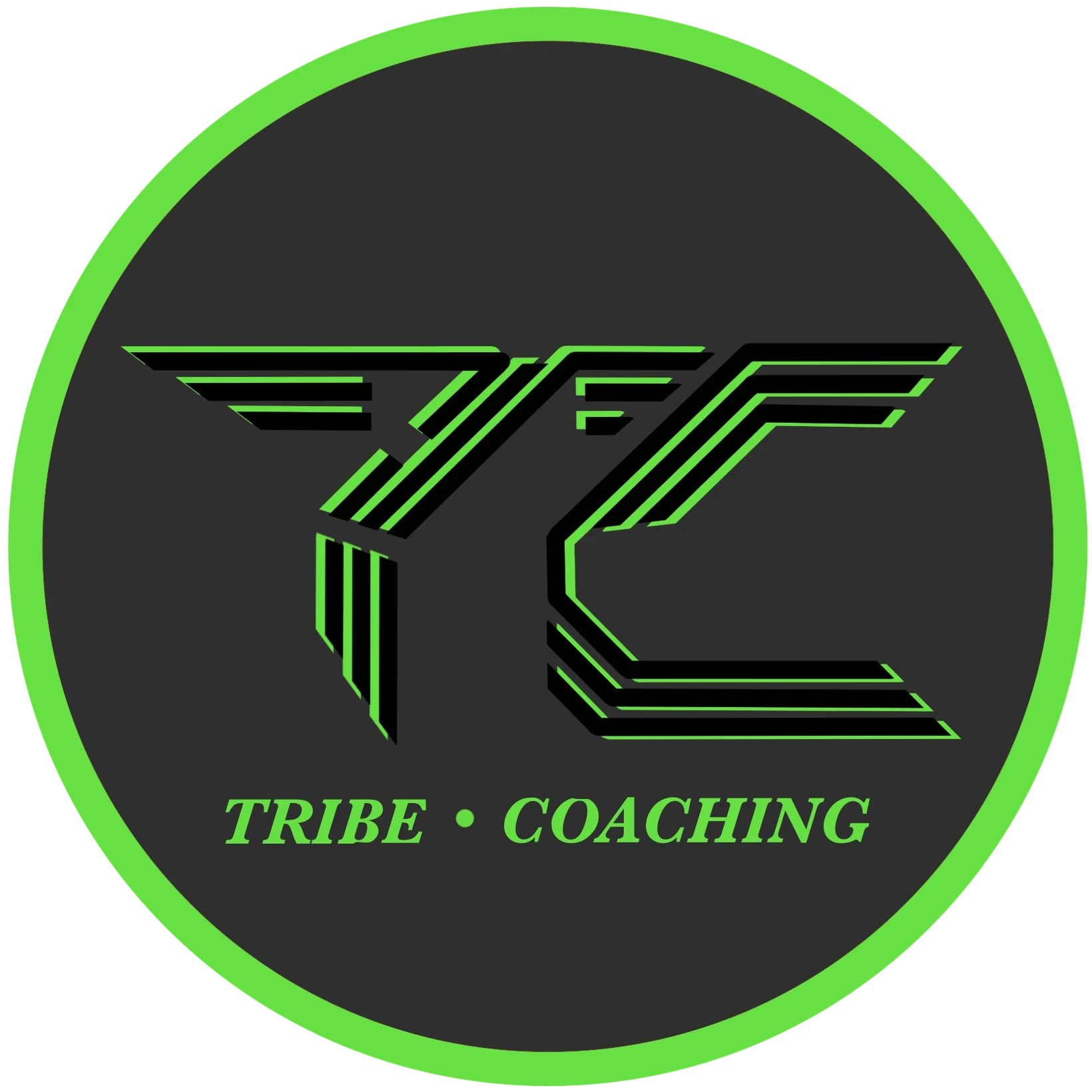
When I first met Lewis he had just gotten tribe coaching off the ground and wanted a way to solidify his brands vision with a logo. It was clear after discussions with Lewis and his rough notes showing me what he envisioned that he wanted his brand to have a feeling of connection and togetherness. So when thinking of embodying the tribal theme I brainstormed ideas pushing the theme in different directions which led to some examples below, which explore a more clean and simple approach versus a more Nordic rune inspired approach:
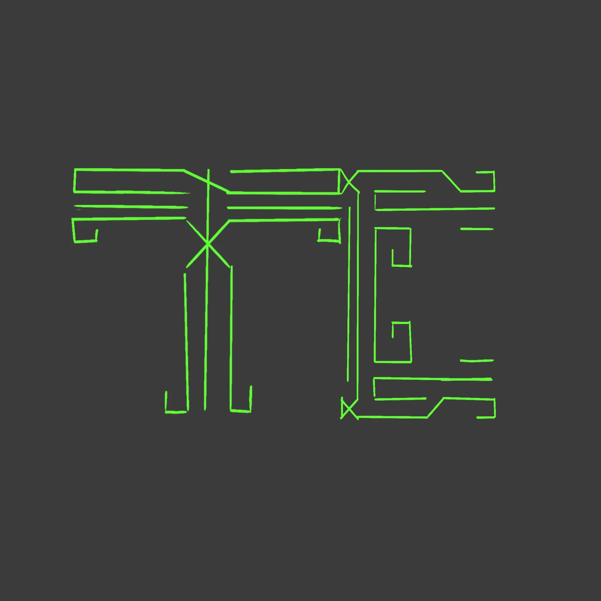
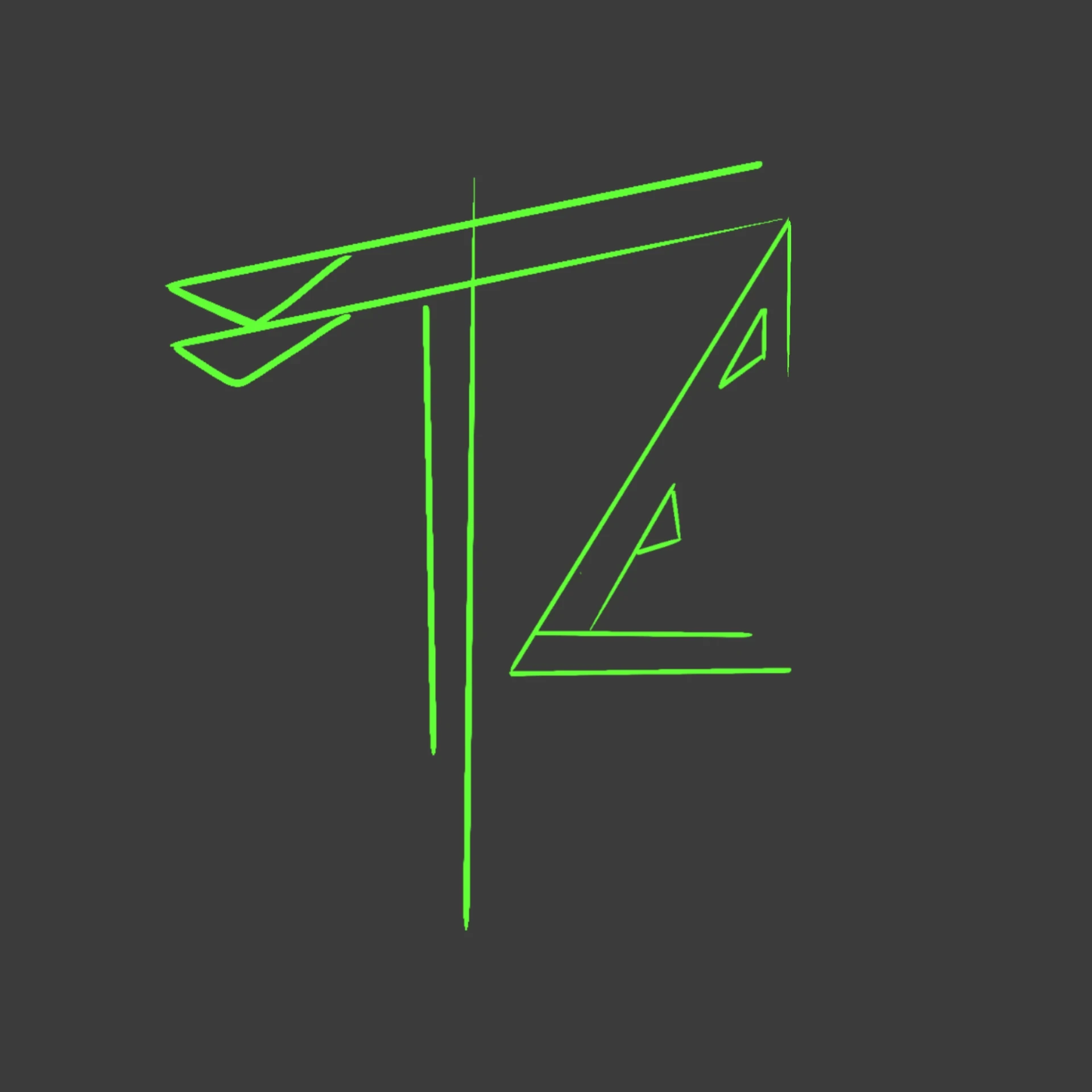
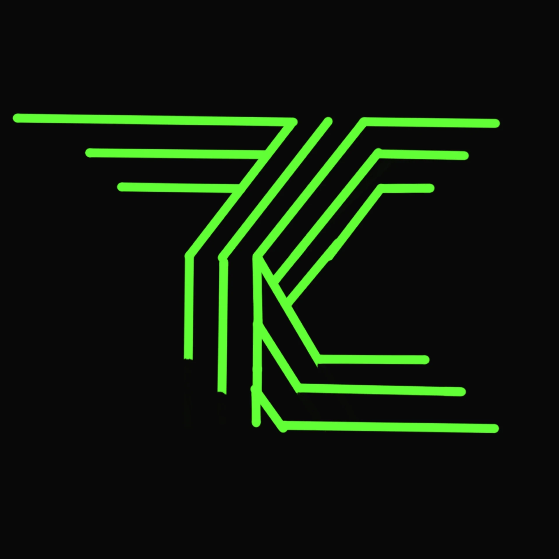
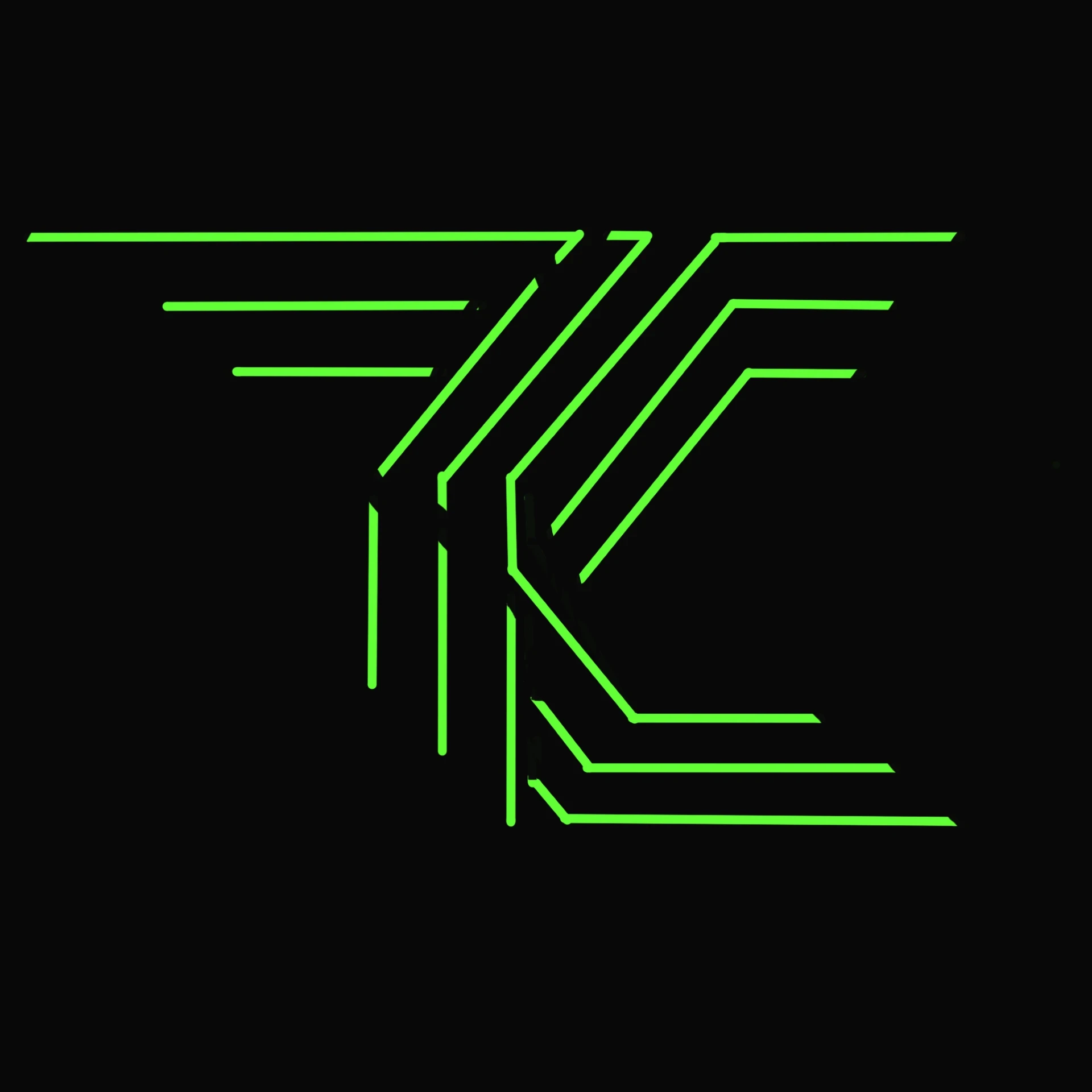
Lewis really liked the line art style of logo, which I ran with experimenting with colour but I still felt like something was missing, that it just wasn't striking enough. Culminating to a series of developments whereby playing with colour I was able to land on a version that nearly hit the mark Lewis: envisioned. However, whilst playing around with the logo it sparked an evolution of the design where I cut through the evolving concept arriving at our final outcome below. Lewis's full thoughts say it best: